Hey...
Figma Migration
Figma Migration
Figma Migration
Figma Migration
From Fragmented Workflows to a Unified Design System
From Fragmented Workflows to a Unified Design System
From Fragmented Workflows to a Unified Design System
From Fragmented Workflows to a Unified Design System

Figma Migration
Unifying Design in Figma
Less chaos. More creating.
Client:
assess
My Role:
Product Designer
Year:
2022
Service Provided:
Product Design, Web Design, Mobile Design
Problems Facing
Problems Facing
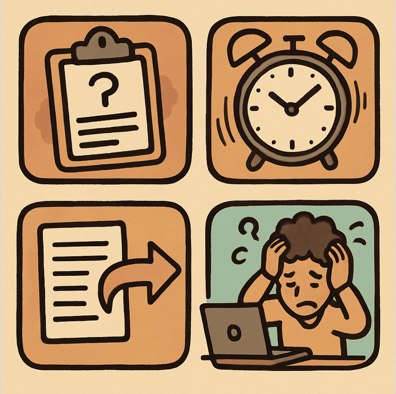
Tired of juggling endless tools
Struggling to manage and scale your design system
Wasting time hunting for files and tracking updates
Cross-team collaboration feels messy
Approvals lost in endless feedback loops
Relying on static and LF wire frames are causing Increase in misalignment and implementation errors
Cluttered folders and lost assets
Requirement
Requirement
The Effortless, Unified Platform for Research, Design, Approval, and Innovation which redefines collaboration by bringing every step of the creative process into one seamless workflow-research, design, approval, storage, and continuous updates—all in a single, intuitive platform.
The Effortless, Unified Platform for Research, Design, Approval, and Innovation which redefines collaboration by bringing every step of the creative process into one seamless workflow-research, design, approval, storage, and continuous updates—all in a single, intuitive platform.
Why Figma ?
Why Figma ?
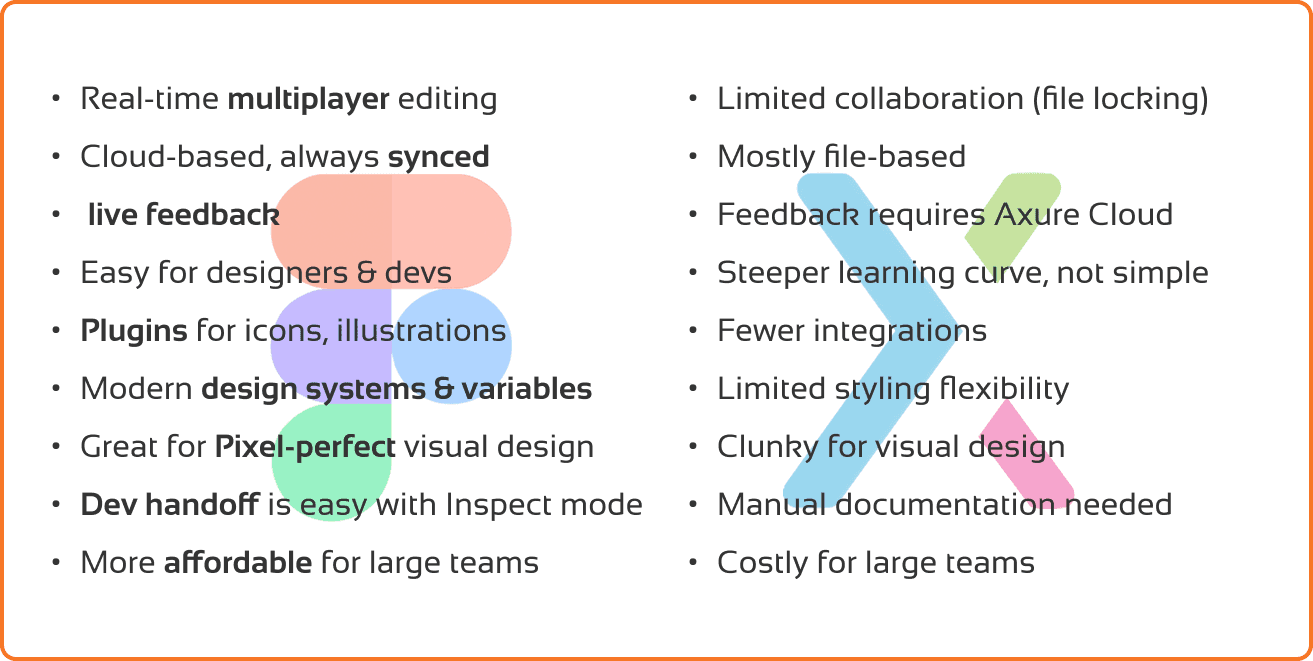
Analysing the Obstacles
Analysing the Obstacles

Priorities :
Collaboration - considering the volume of team
Single Tool - Reducing the dependency on multiple tools
Focus - more on creative and less on documentation
Sync - depend on tool and not on man power by auto sync
Innovative - update along with the fast pace world
All team priorities are pointing towards on Figma.
Success Criteria
Success Criteria

1. Migration Accuracy: 100% of Axure screens are fully replicated in Figma with 95%+ component reusability and zero broken interactions.
2. Efficiency Gains: UX designers achieve 30% faster screen creation, a 90% reduction in manual resizing, and 50% fewer design QA defects due to responsive components.
3. Team Productivity: Dev handoff is 40% faster with 80% fewer feedback loops, and 100% adoption across teams is
Current Workflow
Current Workflow
Design Process - Spec Related
Design Process - Spec Related

Current Documentation Process - Axure
Current Documentation Process - Axure

Results
Less number of deliverables more time.
Conflicts between cross functional teams due to multiple dependencies.
Low creative or innovative possibilities due to less research time.
Conflict between cross functional teams due to inconsistency in data.
Very low workflow knowledge within the design team due to less team discussion sessions.
User Persona
User Persona

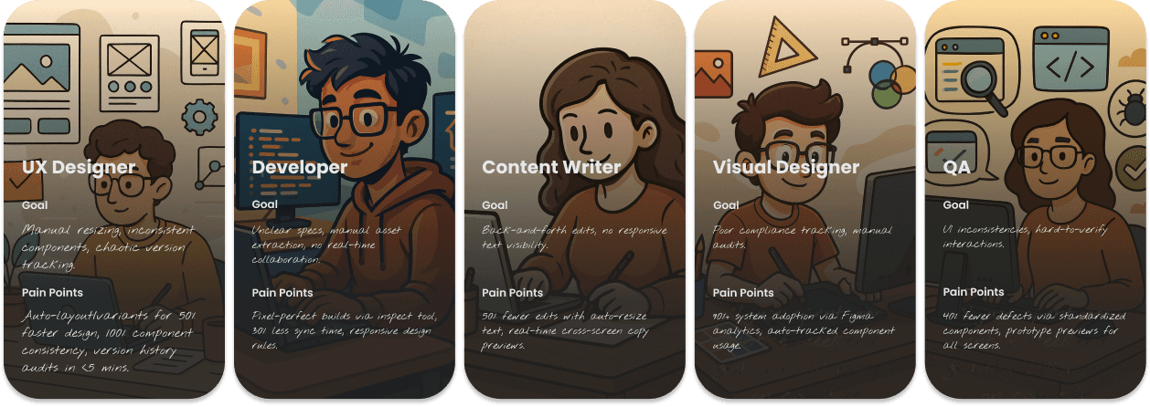
Auto-layout/variants for 50% faster design, 100% component consistency, version history audits in <5 mins.
Manual resizing, inconsistent components, chaotic version tracking.
Pain Points
Goal
UX Designer

Pixel-perfect builds via inspect tool, 30% less sync time, responsive design rules.
Unclear specs, manual asset extraction, no real-time collaboration.
Pain Points
Goal
Developer

50% fewer edits with auto-resize text, real-time cross-screen copy previews.
Back-and-forth edits, no responsive text visibility.
Pain Points
Goal
Content Writer

“I just spent my entire weekend grading 200 essays on cognitive development, and I know half the students won’t even read my feedback.”
Pain Points
Goal
Visual Designer
90%+ system adoption via Figma analytics, auto-tracked component usage.
Poor compliance tracking, manual audits.

“I just spent my entire weekend grading 200 essays on cognitive development, and I know half the students won’t even read my feedback.”
Pain Points
Goal
QA
40% fewer defects via standardized components, prototype previews for all screens.
UI inconsistencies, hard-to-verify interactions.
Competitive Analysis
Competitive Analysis
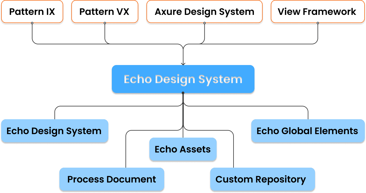
Prior to developing the HP Echo Design System, we benchmarked leading printer UIs (Epson, Canon, Brother) to identify industry gaps. This analysis revealed inconsistent scaling across screen sizes and poor touch optimization - key pain points that directly informed Echo's adaptive components and unified architecture. The findings validated our strategic approach: a single, scalable system would outperform competitors' fragmented designs in both usability and efficiency.
Prior to developing the HP Echo Design System, we benchmarked leading printer UIs (Epson, Canon, Brother) to identify industry gaps. This analysis revealed inconsistent scaling across screen sizes and poor touch optimization - key pain points that directly informed Echo's adaptive components and unified architecture. The findings validated our strategic approach: a single, scalable system would outperform competitors' fragmented designs in both usability and efficiency.
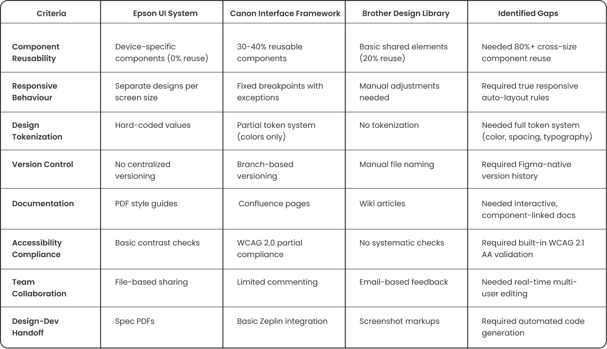
Key Findings
No competitor had true multi-size responsive components → Echo built with auto-layout from start
Documentation was static everywhere → Echo integrated live Zeroheight docs
Handoff processes were manual → Echo implemented Storybook sync
Accessibility was an afterthought → Echo baked WCAG 2.1 into foundations
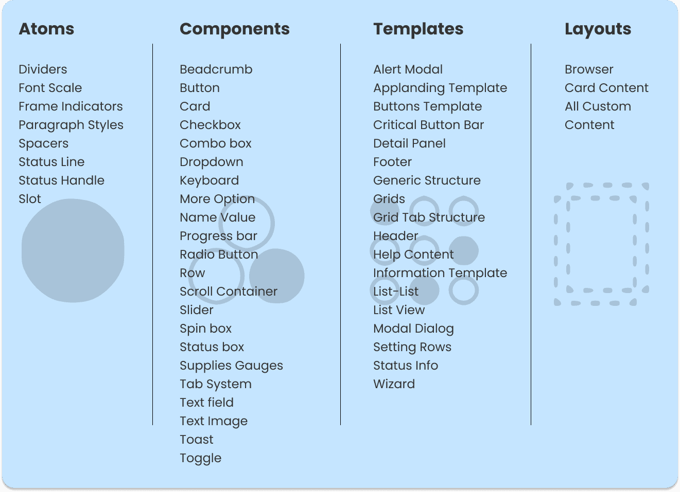
Atomic Design Approach
Atomic Design Approach
Atomic Design provides a structured, scalable framework that breaks complex UIs into modular components (atoms → organisms), ensuring consistency and efficiency. For HP Echo, this approach was critical—it enabled seamless adaptation across multiple printer sizes while maintaining a unified design language. By building from atomic foundations, Echo achieved 90%+ component reuse, outperforming competitors' fragmented systems.
Atomic Design provides a structured, scalable framework that breaks complex UIs into modular components (atoms → organisms), ensuring consistency and efficiency. For HP Echo, this approach was critical—it enabled seamless adaptation across multiple printer sizes while maintaining a unified design language. By building from atomic foundations, Echo achieved 90%+ component reuse, outperforming competitors' fragmented systems.
Consideration & Mapping
Consideration & Mapping
Atoms
Dividers
Font Scale
Frame Indicators
Paragraph Styles
Spacers
Status Line
Status Handle
Slot
Beadcrumb
Button
Card
Checkbox
Combo box
Dropdown
Keyboard
More Option
Name Value
Progress bar
Radio Button
Row
Scroll Container
Slider
Spin box
Status box
Supplies Gauges
Tab System
Text field
Text Image
Toast
Toggle
Alert Modal
Applanding Template
Buttons Template
Critical Button Bar
Detail Panel
Footer
Generic Structure
Grids
Grid Tab Structure
Header
Help Content
Information Template
List-List
List View
Modal Dialog
Setting Rows
Status Info
Wizard
Browser
Card Content
All Custom Content
Components
Templates
Layouts

Updated Documentation Process - Figma
Updated Documentation Process - Figma
All Workflow Folders
Related Workflow Files
Exploration File
Version History
Flow Definition
Screen Definition
Cover Page
Reference Link
Custom Components
WS Components
WIP Design
Decision Pending
Accepted Design
Declined Option
Version no:
Designers name
Writer name
description
Start & End date
IA Link
String Link
SMS Link
Legends
Defined DFD
3 Screen Sizes
Disclaimers
VX Spec Link
Custom Link
Baseline
SMS Table
Behaviour Table
Specific Behaviour
General Links
IA Link
Parent Link
Pattern Link
VX Link
Animation Link
String Link
Assets Link
Logo
Lead Name
WS Name
Components
Echo Design System Link
Components
Each Workflow file contains

Analysis
Single Platform: All approved and work-in-progress file versions are stored in the same, perfectly organized folder, eliminating inconsistencies.
Adaptive Design System: The design elements adjust dynamically, and the screen layout displays all three sizes, ensuring design consistency across different screen dimensions.
Streamlined Asset Management: Clear design system rules ensure the correct assets are linked to their respective screen layouts, reducing human error and maintaining workflow accuracy.
Efficient Firmware Reference: Removing manually structured tables for firmware references eliminates inconsistencies and saves designers time.
Pixel-Perfect Precision: Precisely designed elements remove ambiguity regarding screen structure and sizing during the creative process.
Simplified Prototyping: Intuitive interactions and prototyping allow designers to focus more on creativity.
Centralized Components: A master file containing all components ensures design updates are automatically reflected across all linked files.
Version History: Figma’s version control allows for easy review and auditing of all file changes.
User-Friendly Collaboration: With all files in one location, intuitive navigation, and real-time commenting, stakeholders can collaborate seamlessly.
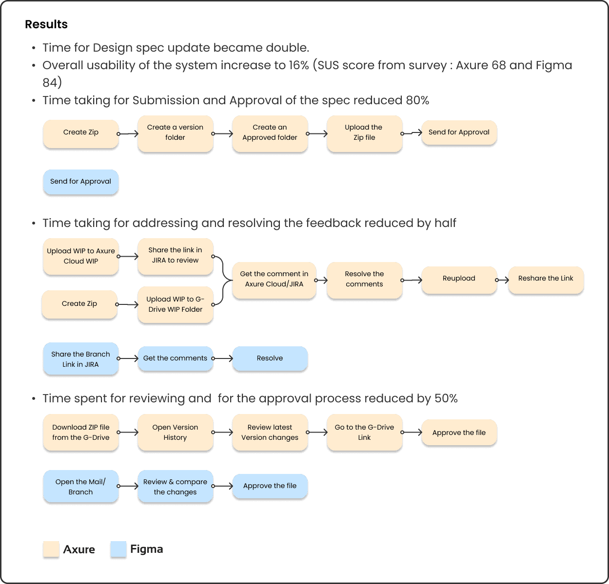
Time for Design spec update became double.
Overall usability of the system increase to 16% (SUS score from survey : Axure 68 and Figma 84)
Time taking for Submission and Approval of the spec reduced 80%
Time taking for addressing and resolving the feedback reduced by half
Time spent for reviewing and for the approval process reduced by 50%
Results
Send for Approval
Share the Branch Link in JIRA
Open the Mail/Branch
Review & compare the changes
Approve the file
Get the comments
Resolve
Create Zip
Create Zip
Upload WIP to Axure Cloud WIP
Download ZIP file from the G-Drive
Open Version History
Review latest Version changes
Go to the G-Drive Link
Approve the file
Upload WIP to G-Drive WIP Folder
Create a version folder
Share the link in JIRA to review
Create an Approved folder
Get the comment in Axure Cloud/JIRA
Upload the
Zip file
Resolve the comments
Send for Approval
Reupload
Reshare the Link
Figma
Axure

Synthesis
Synthesis
UX Designers - the shift eliminated manual resizing headaches—components now auto-adapt across four printer sizes using Figma’s variants and auto-layout, cutting design time in half.
Developers - gained precision with pixel-perfect specs via Figma’s inspect mode and Storybook integration, reducing misinterpretations by 40%.
Testers - fewer UI defects as standardized components ensured consistency, shrinking QA reports by 60%.
Content Writers - leveraged responsive text boxes that previewed copy across all screens upfront, halving revision cycles.
Pattern Team - automated compliance checks, replacing manual audits with real-time usage analytics.